

If you strip colour out of a painting and look only at the light and dark, what you are left with is tone. Get tone right and a picture feels solid, convincing and atmospheric. Get it wrong and even the best drawing or colour palette can look flat.
For painters, tone in art is not an optional extra. It is the quiet structure that holds everything together. This guide is written with Angela Edwards’ audience in mind, but it will help whether you are an artist yourself, a student, or someone who simply wants to understand paintings more deeply.
We will look at what tone in art actually means, how it relates to value, light and shade, and how tonal choices shape mood and composition. Along the way there are practical ways to train your eye that you can use in the studio or in a gallery.
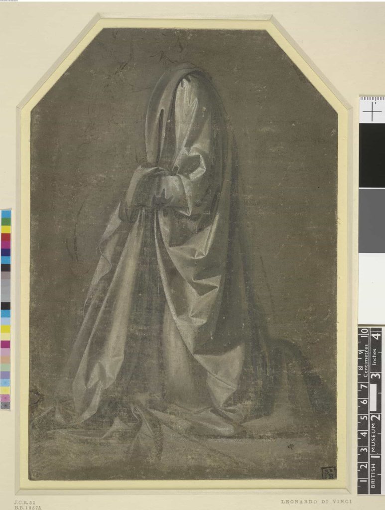
What do we mean by “tone in art”
In visual art, tone (or tonal value) is the relative lightness or darkness of a colour or area. Put simply, it is how light or dark something appears, regardless of what hue it is.
If you imagine a simple strip that runs from pure white at one end to pure black at the other, every stop in between is a different tone. Artists often talk about this as a tonal scale or value scale.
A bright lemon yellow and a pale grey might be completely different colours, but they can share the same tonal value if they are equally light. This is why artists sometimes convert reference photos to greyscale or squint at a scene. It helps them ignore hue and notice tone.
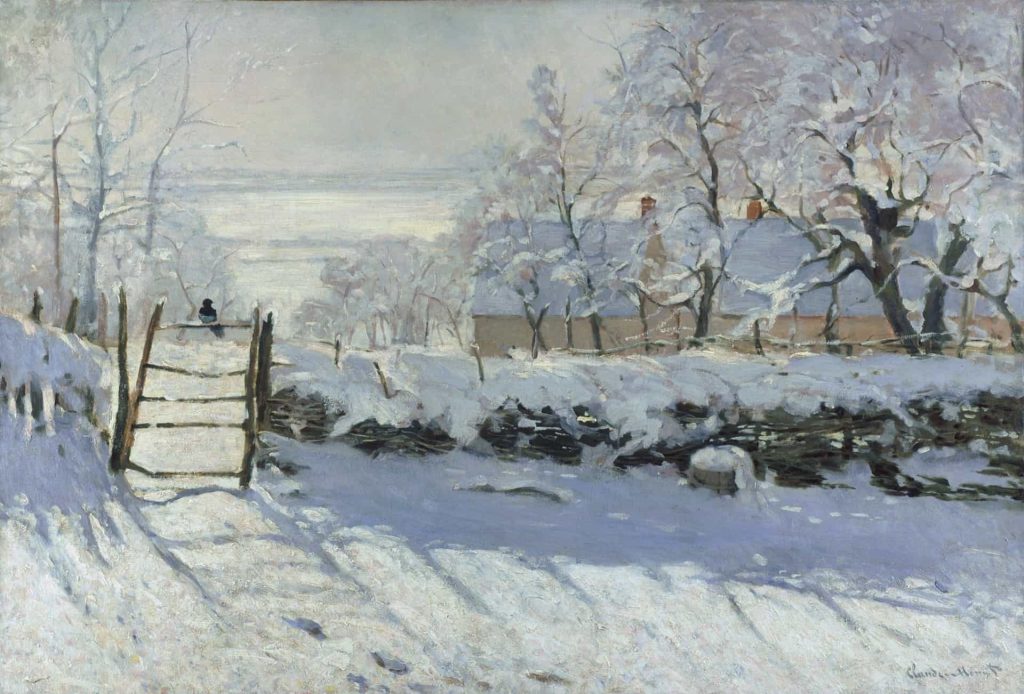
Tone versus colour, hue and value
It is easy to get lost in terminology, so it helps to separate a few related ideas.
Colour or hue is the family a colour belongs to red, blue, green, yellow and so on. Value is the degree of lightness or darkness of that colour. Tone is often used interchangeably with value, especially in painting, to describe that light to dark relationship.
Shade and tint are more specific. A shade is a colour mixed with black, which makes it darker. A tint is a colour mixed with white, which makes it lighter. A tone, in a stricter colour theory sense, is a colour mixed with grey, lowering its intensity.
In everyday studio practice, most painters use tone and value in a practical way:
- How light is this area compared with what is next to it
- Is this shadow really as dark as I think
- Do I need a stronger tonal contrast to make this edge work
Thinking in those terms is more important than memorising labels.
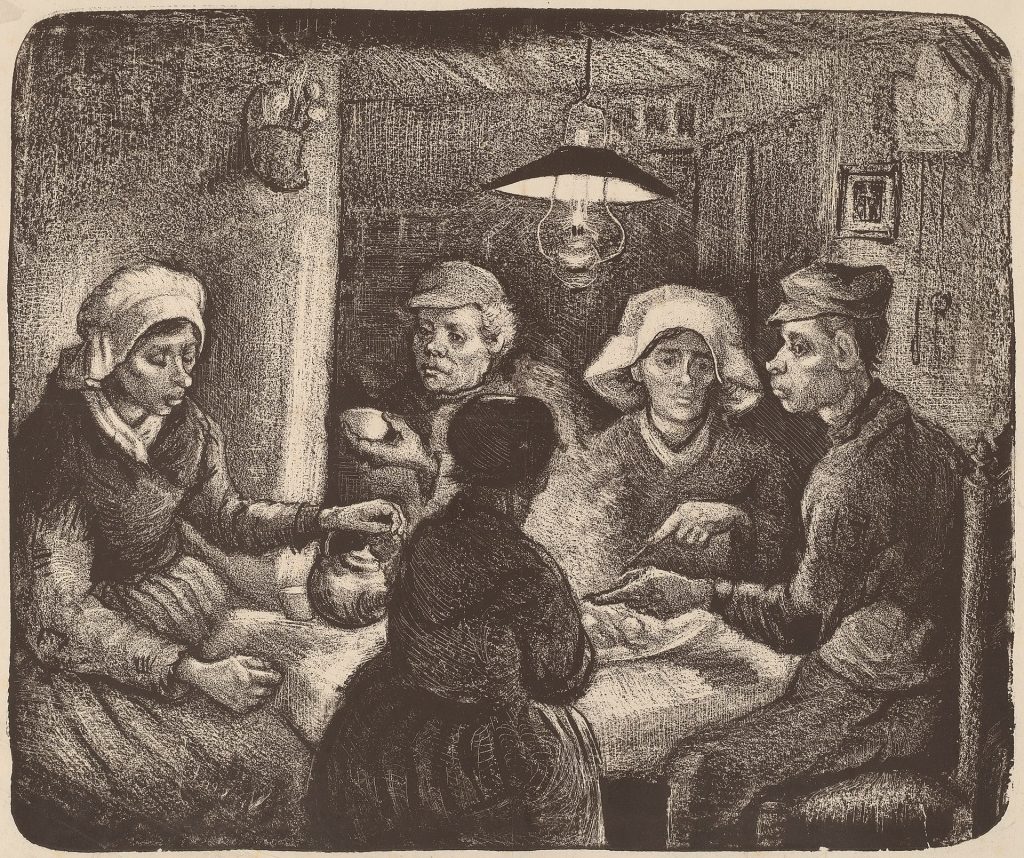
Why tone in art matters so much
If you remove tone, a painting loses structure. It might still have interesting colour, but objects stop feeling solid and spaces stop feeling convincing. That is because tone is what allows you to read form, depth and light.
In drawing classes, students are often asked to work in charcoal or pencil before they are allowed near colour. The reason is simple. If you can describe light, mid tone and shadow with a stick of charcoal, you already understand most of what painting needs. Colour becomes an extra layer rather than a rescue operation.
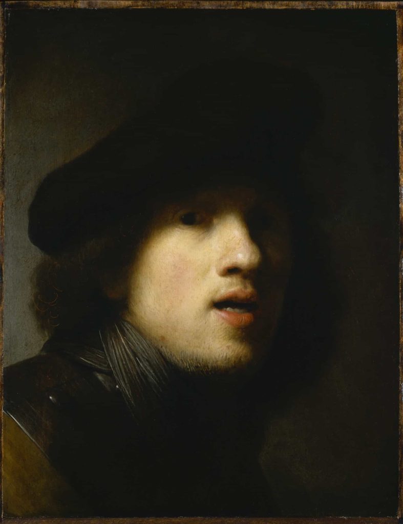
Tone is also one of the most powerful tools for directing attention. The human eye is drawn to areas of strong contrast, especially where the lightest light meets the darkest dark. Painters have used this knowledge for centuries to lead the viewer’s gaze around a composition.
Think of a Baroque painting where a figure’s face emerges from deep shadow, or a contemporary work where a pale figure floats against a dark ground. Even if you know nothing about the artist, your eyes go straight to the highest tonal contrast.
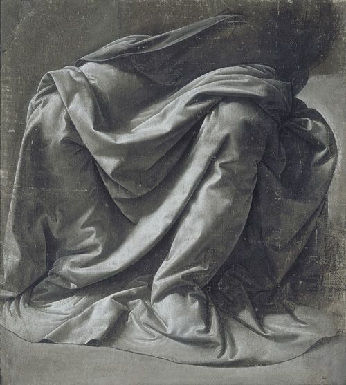
Three broad bands of tone: lights, mid tones and darks
Although there are endless possible tonal steps, it is helpful to think in three broad bands: light tones, mid tones and dark tones.
Light tones are the palest areas highlights on a forehead, a reflection on water, the side of a cup catching strong light. They do not always have to be white, but they feel bright.
Mid tones sit in between. They carry much of the information about local colour and gentle shifts of form. In many paintings, most of the surface is actually mid tone, with lights and darks used more sparingly.
Dark tones include cast shadows and any deep recesses. They can create drama and weight. Used carefully, they anchor a composition and keep lighter passages from floating away.
Artists adjust the ratio of these bands to create different moods. A painting dominated by mid tones with a few small accents of light and dark will feel calm and even. A painting that swings between extremes of light and dark with little middle ground will feel more theatrical or tense.
Tone in drawing and tone in painting
The idea of tone appears in both drawing and painting, but it behaves slightly differently in each.
In drawing, tone is usually built up with graphite, charcoal, ink or pastel. You might hatch lines, smudge with a stump, or lay down flat areas of value. Because there is no colour to distract you, tonal relationships are very clear.
In painting, tone interacts with hue and saturation. A pure ultramarine and a muted grey blue can share the same tonal value but feel completely different in colour temperature. Balancing tone and colour is part of what makes painting so absorbing.
Many painters use tonal underpainting to organise value before adding richer colour. A thin monochrome layer often in warm browns or cool greys maps out the main lights and darks. Colour is glazed or scumbled over the top once the tonal pattern works on its own. This way of working goes back to Renaissance and Baroque painting and is still extremely useful in contemporary practice.
Global tone and local tone
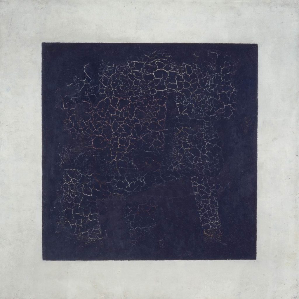
When artists talk about global tone, they mean the overall tonal key of an artwork whether the whole piece leans light and airy, dark and moody, or sits somewhere in a mid range. Local tone refers to the value of individual objects and areas within that overall key.
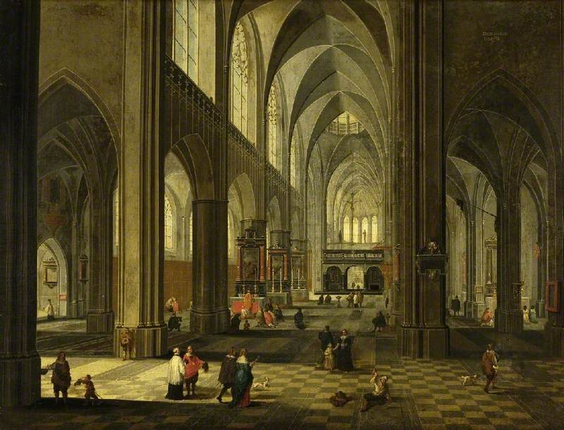
A painting with a high key global tone might keep everything in a pale, luminous band, with only gentle dips into mid tone. Think of a foggy landscape or an interior flooded with diffuse light. A low key painting might place almost everything in shadow, with a few small sparks of light.
Local tone is the way you distinguish one form from another inside that global decision. A black coat in bright sun can actually be lighter in tone than a white shirt in deep shadow. The trick is not to assume, but to observe and compare.
Understanding the difference helps you keep control of mood. You can push global tone slightly darker or lighter without losing the clarity of local relationships, or you can deliberately break local tone to create a focal point.
Tone and mood: how light and dark feel
Tone carries emotional weight. Even before you process subject matter, you respond to the overall pattern of light and dark.
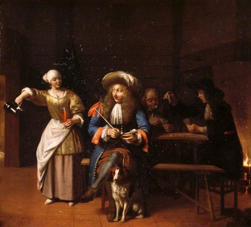
High key paintings with plenty of light tones and only gentle shadows often feel open, gentle or nostalgic. Low key paintings with deep shadows and sharp contrasts can feel dramatic, intimate or unsettling.
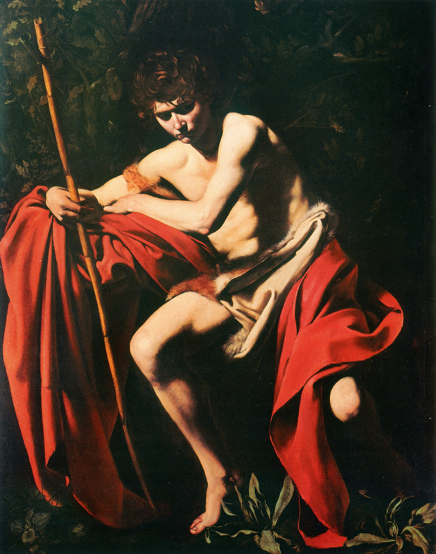
Chiaroscuro, the use of strong light and shadow is a classic example. Artists from the Renaissance onwards used it to model form and focus attention. In its most intense form, known as tenebrism, most of the picture is submerged in darkness, with figures emerging from a single light source.
Contemporary artists may not use the term, but the logic is the same. A face lit by a phone screen in an otherwise dark room uses tonal contrast in exactly this way. So does a painting where a pale building glows against a stormy sky.
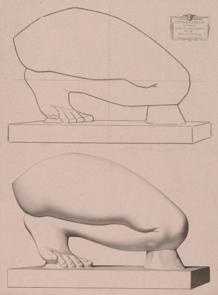
Cours de dessin Pl.28 – Charles Bargue
Tone in abstraction and figurative work
Tone is as important in abstract painting as it is in figurative work. In some ways it is even more exposed, because there is no subject matter to carry the image.
In abstract compositions, tonal contrast helps create a sense of movement, balance and depth. Even with flat colour, some shapes will read as nearer or further depending on their value relative to the background. A cluster of dark shapes against a mid tone field will feel heavier than a scatter of small light accents.
In figurative painting, tone has the extra task of describing volume and space. A face is not a flat patch of skin colour; it is a set of planes catching light differently. A strong tonal structure can hold a likeness together even when colour is pushed or simplified.
For painters who work between abstraction and figuration, tone is often the glue. You can dissolve edges, blur features or distort perspective, but if the tonal pattern still makes sense, the painting will hold.
Practical ways to train your eye for tone
You do not need special equipment to get better at seeing tone. A few habits make a big difference over time.
One simple exercise is to make small thumbnail sketches in pencil or marker before starting a painting. Keep them rough and focus only on three values light, mid and dark. Decide where your darkest dark and lightest light will be and how much space each will occupy. These sketches become a map you can refer to when colour starts to distract you.
Another useful trick is to use your phone camera to take a quick photo of your work in progress and convert it to black and white. Seeing your painting without colour lets you check whether the tonal structure is strong. Do focal areas still read clearly. Are important forms getting lost because their tone is too close to the background.
You can also practise looking at tonal values in existing paintings. In a gallery, try half closing your eyes to blur detail. Notice where the lightest passages sit, where the darkest are, and how much of the picture is taken up by mid tones. Over time you will start to recognise how different artists use tone to control your gaze.
Common tonal problems and how to fix them
Certain tonal issues crop up again and again in beginner and intermediate work. Recognising them is the first step to correcting them.
One is what teachers sometimes call a tonal soup, everything sits in a similar mid range, so forms do not separate and nothing stands out. The cure is to commit more strongly to your lightest lights and darkest darks, even if that feels risky. Check a black and white photo of your reference and your painting side by side. If the reference has a wide spread from near white to near black and your painting does not, you will know where to push.
Another is painting what you think rather than what you see. For example, assuming that local white objects must be the lightest areas, even when they are in shadow. This can flatten form. Comparing areas directly is this patch really lighter or darker than the one beside it is more reliable than naming colours in your head.
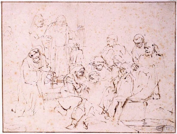
A third issue is over reliance on outlines. Heavy line around every shape can undermine tonal modelling, because it declares an edge even where tone would naturally soften it. Switching to a drawing medium that encourages you to work with patches of tone rather than line can break that habit.
Tone in digital tools and photography
Digital tools can be very helpful for understanding tone. Most editing software allows you to view an image in greyscale or to display a histogram, which shows how tones are distributed from black to white. Photographers talk constantly about exposure, contrast and value because they know how dramatically these affect the feel of an image.
Painters can borrow that mindset. Looking at a painting through a camera can reveal imbalances that are harder to see while you are up close at the easel. It is not about letting the device make decisions for you, but about using every tool you have to understand what the painting is doing.
Tying it back to how you actually paint
All this theory is only useful if it changes what you do in the studio. A simple approach is to build tone into your process from the start.
Begin with a clear sense of where your main light source is and which areas really need to be the lightest and darkest. Commit to a tonal plan in small thumbnails. Think of the global tone of the painting is it going to lean light, dark or sit in the middle and be consistent. Then, as you paint, keep checking that individual decisions support that plan rather than pulling against it.
For artists whose work, like Angela Edwards’, often moves between figuration and abstraction, tone can be a way of holding that space. You can allow forms to dissolve and reappear, let edges blur and surfaces fragment, as long as the tonal structure still gives the eye something to hold on to.
For viewers and collectors, understanding tone in art gives you another way into a painting. The next time you stand in front of a work you are drawn to, ask yourself not only what it shows, but how its pattern of light and dark is making you feel. Often, tone is doing more of the emotional heavy lifting than colour alone.
When you start to see that, the idea of tone stops being an abstract theory and becomes part of how you experience painting every day.
