I. Introduction
A. Definition of colour theory and its relevance in art.
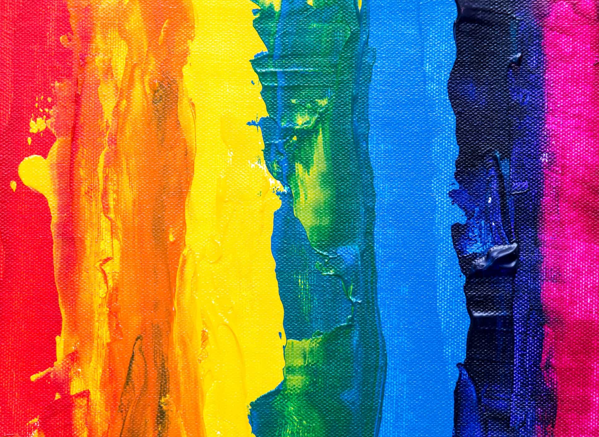
Colour theory is a fundamental concept that encompasses a collection of rules and guidelines regarding the use of colour in art and design. It’s an essential framework that artists utilise to communicate visually through the medium of colour. Through colour theory, artists can create harmony, contrast, depth, and evoke emotions within their work.
B. Brief historical background of colour theory.
Colour theory has its roots deep in history. One of the earliest and most influential books on colour theory is Leonardo da Vinci’s “A Treatise on Painting,” where he discussed the use of colour in painting. However, it was not until Sir Isaac Newton’s work in the 17th century that the Colour Wheel was developed. Later, in the 18th century, Moses Harris created more elaborative versions of the Colour Wheel. Fast forward to the 20th century, Johannes Itten’s work at the Bauhaus school played a significant role in modern colour theory, with his book “The Art of Color” being considered a seminal text.
II. The Basics of Colour Theory
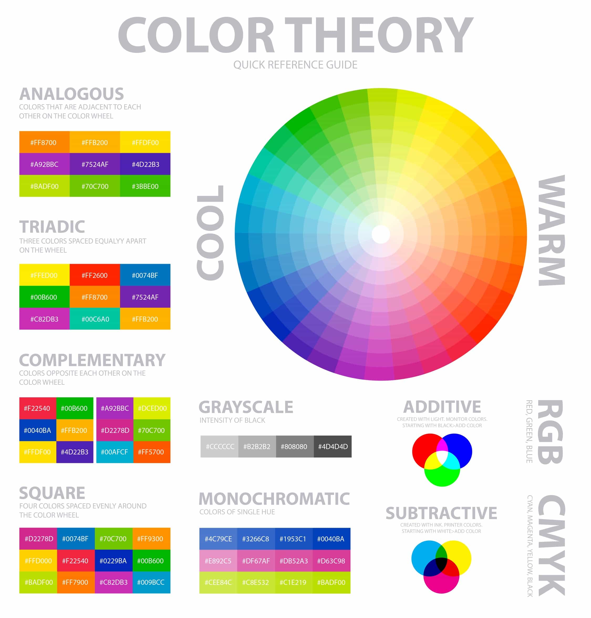
A. The Colour Wheel
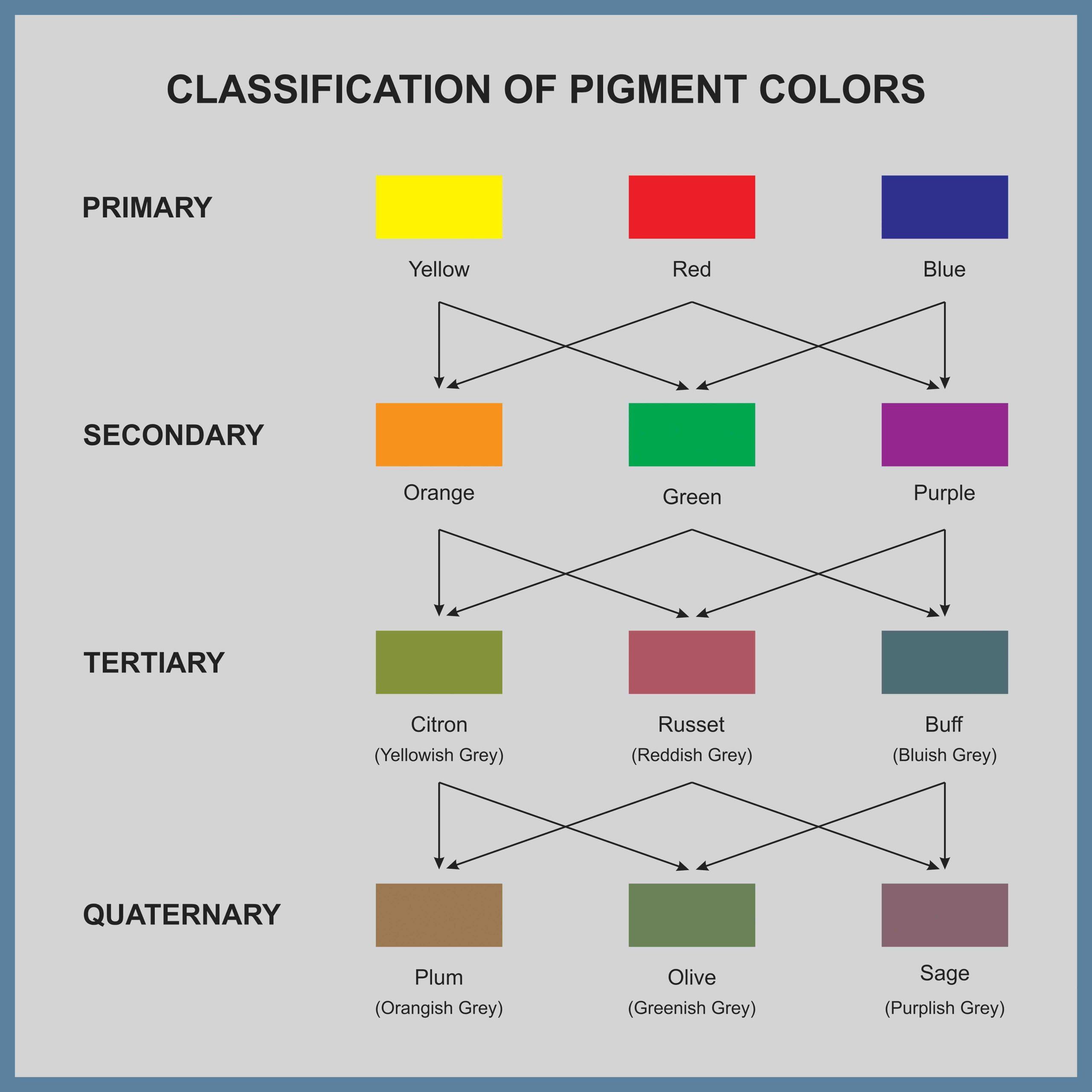
The Colour Wheel is a visual representation of colours arranged in a circle, used to show the relationships between primary colours, secondary colours, and tertiary colours.
- Primary Colours: Red, blue, and yellow. These colours are considered the building blocks of all other colours and cannot be created by mixing other colours together.
- Secondary Colours: Green, orange, and purple. These are created by mixing two primary colours. For example, mixing blue and yellow makes green.
- Tertiary Colours: These are created by mixing a primary colour with a secondary colour. Examples include red-orange and blue-green.
B. Colour Harmony
Colour harmony involves using colours in a way that is visually pleasing and balanced. There are several schemes based on the colour wheel that artists use to create harmony:
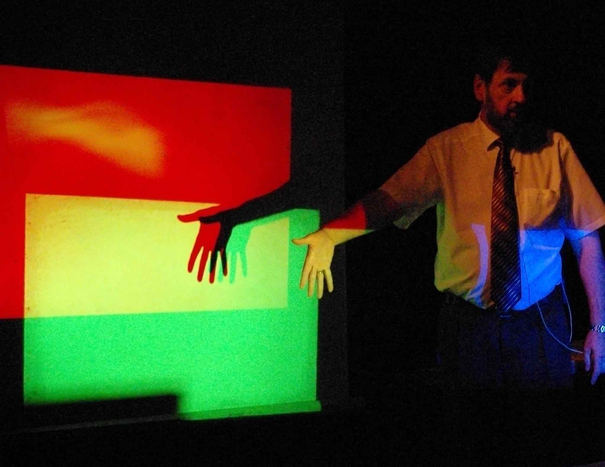
- Complementary Colours: These are colours located opposite each other on the colour wheel, such as red and green. Complementary colours create high contrast and can make each other appear more vibrant when placed side-by-side.
- Analogous Colours: These are colours that are located next to each other on the colour wheel, such as red, orange, and yellow. Analogous colours often work well together, creating a sense of unity and cohesiveness.
- Triadic Colours: A triadic colour scheme uses three colours that are evenly spaced around the colour wheel, such as red, yellow, and blue. This scheme is vibrant and offers a harmonious balance.
C. Colour Temperature
The temperature of a colour refers to how warm or cool it is perceived to be.
- Warm Colours: These include reds, oranges, and yellows. They are associated with warmth and are often used to convey feelings of happiness, energy, and passion.
- Cool Colours: Including blues, greens, and purples, cool colours are often associated with calmness, serenity, and sometimes sadness.
D. Tints, Shades, and Tones
- Tint: A tint is obtained when white is added to a colour, making it lighter.
- Shade: A shade is created when black is added to a colour, making it darker.
- Tone: Adding grey to a colour creates a tone, which can make the colour more subtle and less intense.
Understanding these basic concepts of colour theory is essential for artists who want to create balanced and compelling artwork. By mastering the use of the colour wheel, colour harmony, colour temperature, and tints, shades.
III. Psychological Aspects of Colour
A. The emotional and psychological effects of colours.
Colours have the power to evoke emotions and influence our psychological state. For example, red is often associated with passion and energy, while blue is seen as calming and trustworthy. Understanding these associations can be vital for artists who want to communicate specific themes or emotions through their work. The psychology of colour is a vast topic, and for those interested in delving deeper into this subject, the book “Colour Psychology and Colour Therapy” by Faber Birren is a great read (available here).
B. Cultural associations of colours.
Besides the general psychological effects, colours often carry cultural meanings. For instance, in many Western cultures, white is associated with purity and innocence, while in some Eastern cultures, it is linked with mourning and death. It is essential for artists to be mindful of these cultural associations, especially when their work is intended for an international audience. The article, “How Different Cultures Understand Time”, provides interesting insights into the cultural meanings of colours.
IV. Practical Applications in Art
A. Colour Schemes in Composition
Artists employ colour schemes to create cohesive and harmonious compositions. By understanding the various colour harmonies discussed earlier, artists can make informed decisions on which colours to use to achieve a desired effect. An invaluable tool for this purpose is Adobe Color, which allows artists to experiment with different colour schemes.
B. Techniques for creating depth and space using colour
Colour plays a significant role in creating the illusion of depth and space in art. By understanding concepts like atmospheric perspective, where cool colours can be used to make objects appear further away, artists can create more realistic compositions. A resourceful article, “Using Colour to Create Depth in Art”, sheds more light on this topic.
C. Using colour to evoke mood and atmosphere
As discussed in the Psychological Aspects of Colour, colour can be used to evoke specific moods and atmospheres. Warm colours might be used to create an inviting, cheerful scene, while cooler colours might be used for a more somber, tranquil atmosphere. For artists looking to refine their skills in this area, James Gurney’s book “Color and Light: A Guide for the Realist Painter” (available here) is an excellent resource.
V. The Role of Colour in Different Art Forms
A. Colour in Painting
In painting, colour is one of the primary tools for expression. It can be used to create mood, define form, and convey emotions. Master painters like Vincent van Gogh were known for their expressive use of colour. His painting “The Starry Night” showcases his skill in using vibrant colours to evoke emotion. The Tate Museum’s website offers a comprehensive overview of the history of colour in painting.
B. Colour in Graphic Design
In graphic design, colour is used to grab attention and convey messages quickly. Branding often relies on colour to create a memorable identity. For instance, red is frequently used in logos because it’s eye-catching and evokes a sense of urgency. The website Canva has a useful guide on the meanings of colours, which is invaluable for graphic designers.
C. Colour in Photography
Photography uses colour to capture and convey the essence of a moment. Skilful use of colour can make a photograph come alive. Some photographers, like Steve McCurry, are known for their exceptional ability to use colour to tell a story. This article on Digital Photography School discusses how to use colour effectively in compositions.
D. Colour in Film and Media
In film and media, colour grading is used to give movies a certain mood or tone. For example, a blue tint might be used in a thriller to create a dark, moody atmosphere. Wes Anderson, a filmmaker known for his visually stunning films, uses colour palettes that are integral to the storytelling. This article, “Understanding the Use of Colour in Film”, goes into more depth about using colour in movies.
VI. Mastering Colour Mixing
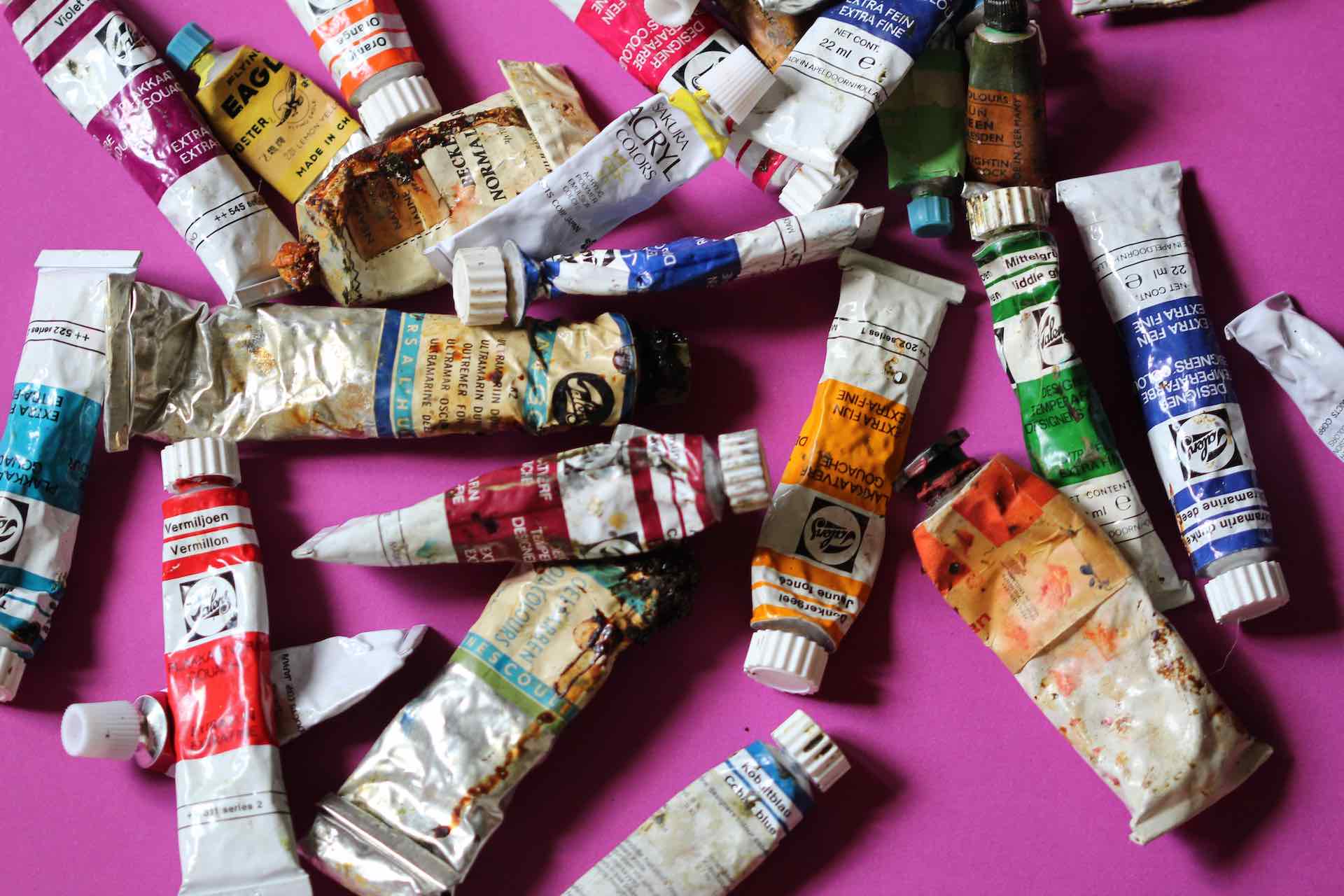
A. Understanding pigments and mediums
The physical properties of pigments and mediums can affect how colours mix and appear on a surface. Different pigments have different characteristics, such as transparency and tinting strength. Additionally, the medium (e.g., oil, acrylic, watercolour) affects the behaviour of the pigment. A fantastic resource for understanding pigments and mediums is “The Artist’s Handbook” by Ralph Mayer (available here).
B. Tips and tricks for mixing colours effectively
Mastering colour mixing is an essential skill for artists. Understanding how colours interact and how to achieve the desired hue is critical. One should practice by creating colour charts and experimenting with different combinations. This guide on Colour Mixing from Creative Bloq offers tips and tricks for mixing colours effectively.
VII. Modern Interpretations and Uses of Colour Theory
A. Digital Colour and Design
In the digital age, colour theory has expanded beyond traditional mediums and entered the realm of digital art and design. Digital artists and designers use software that allows for a virtually limitless range of colours. Tools like Adobe Color CC enable artists to explore and create colour schemes digitally. Additionally, websites like Colour Lovers provide a community platform for sharing and discussing colour palettes.
B. Colour Trends in Contemporary Art
Contemporary art often reflects societal changes and trends, including in the use of colour. Some artists use bold, vibrant colours to make political statements or reflect cultural diversity, while others may use muted tones to create a more subdued mood. The Pantone Colour Institute, known for its annual ‘Colour of the Year’, is a good resource for keeping abreast of colour trends. You can find their latest insights on colour trends in contemporary art here.
VIII. Case Studies
A. Analysing Famous Works of Art for Colour Composition
Studying the works of master artists is an excellent way to learn about colour composition. For instance, analysing Johannes Vermeer’s use of blue and yellow in “Girl with a Pearl Earring” can provide insights into how colour can be used to create focal points and depth. The National Gallery’s website offers a treasure trove of information and analyses on famous paintings.
B. How Artists Use Colour Theory to Convey Messages and Themes
Colour is not just a visual element but a powerful tool to convey messages and themes. For instance, Frida Kahlo’s use of vibrant colours often reflected her Mexican heritage and personal experiences. An interesting read on this subject is “Color Codes: Modern Theories of Color in Philosophy, Painting and Architecture, Literature, Music, and Psychology” by Charles A. Riley II, which can be found here. This book delves into the role of colour in various fields, including art, and how it’s used to communicate different themes
IX. Common Mistakes and How to Avoid Them
A. Muddy Colours
One common mistake that artists make is ending up with muddy colours, which can make a painting look dull or dirty. This usually occurs when too many colours are mixed together without a clear understanding of how they interact. To avoid this, be mindful of the colours you are combining and try to keep your mixtures simple. Artist Network has a detailed guide on how to avoid muddy colours in your paintings.
B. Overuse or Lack of Contrast
Using too many bright colours without adequate contrast can result in a piece that’s too harsh on the eyes, whereas not using enough contrast can make an artwork look flat. Striking a balance by utilising values and tones effectively is essential. This article from EmptyEasel discusses the importance of contrast in creating depth in art. Some artists use this to purposely to jar when viewed.
C. Inconsistent Light Sources
Having inconsistent light sources in a painting can confuse the viewer and make the artwork less believable. To avoid this, decide on a primary light source and be consistent with how it affects the colours and shadows in the piece. Here’s an in-depth article on how to use light and shadow in art from Creative Bloq.
X. Tips and Best Practices
A. Developing a Colour Palette
Before beginning a piece, it’s often helpful to develop a colour palette that complements the mood and message you want to convey. Consider the emotions that certain colours evoke and how they can be combined harmoniously. Here’s a helpful guide from Adobe on developing colour palettes.
B. Observing Colours in Nature and in Master Artworks
Observing and analysing colours in nature and master artworks can provide invaluable insights. Pay attention to how colours change with lighting and atmosphere. Visit art galleries, and study the works of masters, noticing how they use colour to evoke emotions.
C. Experimenting with Unusual Combinations
Don’t be afraid to experiment with unusual or unexpected colour combinations. Sometimes, a non-traditional approach can result in stunning and innovative artwork. This article from ArtTutor provides some ways you can experiment with colour in your art.
XI. Conclusion
A. Recap of the Importance of Colour Theory in Art
In conclusion, colour theory is an indispensable tool for artists. From the basic understanding of the colour wheel and colour harmony to the psychological impacts of colour, it plays a crucial role in creating engaging and meaningful art. Mastering the use of colour can enhance the composition, depth, mood, and overall quality of your artwork.
B. Encouragement for the Reader to Experiment and Find Their Unique Colour Voice
As an artist, it’s important to remember that while colour theory provides guidelines, art is also about expression and creativity. So, don’t hesitate to experiment with colour, even if it means breaking some rules. In the end, finding your unique colour voice and the ways in which you can communicate through colour is a rewarding journey that can continuously evolve. Enjoy experimenting.
XII. Further Resources and Learning
A. Recommended Books on Colour Theory
- Color Theory: An essential guide to color-from basic principles to practical applications by Patti Mollica
- Interaction of Color: 50th Anniversary Edition by Josef Albers
- The Art of Color: The Subjective Experience and Objective Rationale of Color by Johannes Itten
B. Links to Tutorials and Courses on Colour Theory
- Color Theory: The Basics – A Udemy course that covers the fundamentals.
- Color for Design and Art – A Coursera course that delves into the role of colour in art and design.
- Painting Color and Mood – Skillshare course focusing on using color to convey emotions.
C. Suggestions for Artists to Study for Colour Mastery
- Vincent van Gogh: Known for his vibrant and emotional use of colour.
- Mark Rothko: Famous for his abstract paintings that explore color relationships.
- J.M.W. Turner: A master in using color for atmospheric landscapes.
Delve into these resources and explore the world of colour to enhance your artistic prowess. Remember, the journey of mastering colour is one of continuous learning and experimentation. Happy painting!